


How UX/UI Impacts Your Health & Wellness App
Even the best features fall flat without thoughtful design. Discover how strong UX/UI in wellness apps supports retention, trust, and outcomes — with real examples, emerging trends, and data-driven insights for 2025–2026.

Why UX and UI Design Matter in Health & Wellness Apps
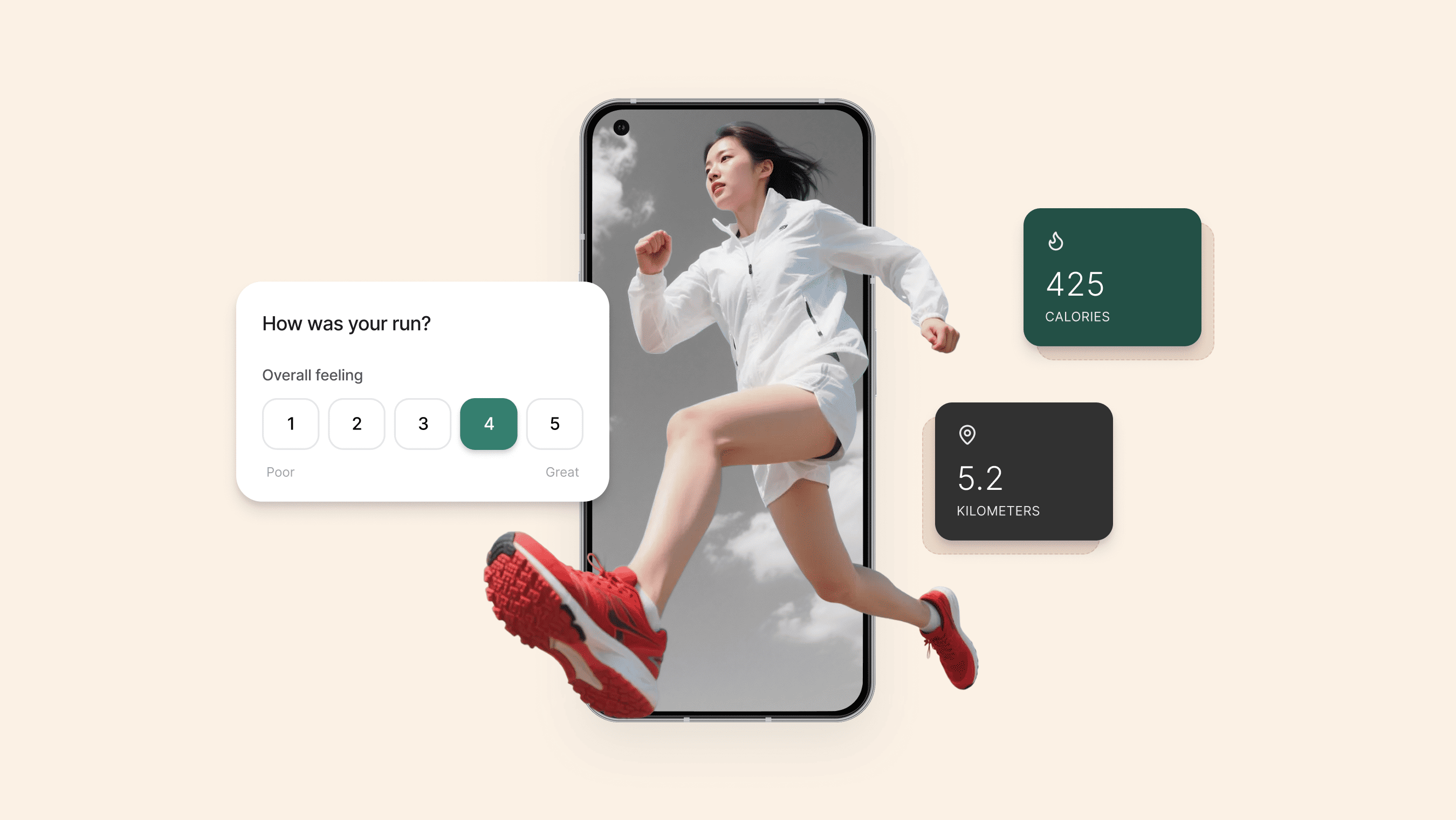
Wellness apps are everywhere — from meditation to sleep, fitness to nutrition. But even the most powerful features can fail if users get frustrated or confused. That’s where UX (User Experience) and UI (User Interface) design come in.
A strong UX/UI strategy improves:
- Retention: Users come back when they can easily complete tasks.
- Trust: Clear flows reduce anxiety and errors, especially in health-related tasks.
- Outcomes: Simple, intuitive interfaces help users form healthy habits and achieve their goals.
In a space where users often act under stress or time pressure, thoughtful design is essential.
According to the WHO, over 1 billion people worldwide experience some form of disability, highlighting how accessible design isn't a nice-to-have, but a necessity.
What Is UX Design in Wellness Apps?
UX (User Experience) focuses on how your app works — the logic, flow, and clarity of the experience. In wellness apps, good UX helps users:
- Track progress without friction
- Find support when needed
- Stay consistent with routines
Bad UX leads to confusion, drop-off, or even health-related errors. For clinician tools, it can impact outcomes and compliance.
Best UX practices for wellness apps include:
- Clear onboarding and task flows
- Early usability testing with real users
- Feedback loops for continuous improvement
- Accessibility from day one
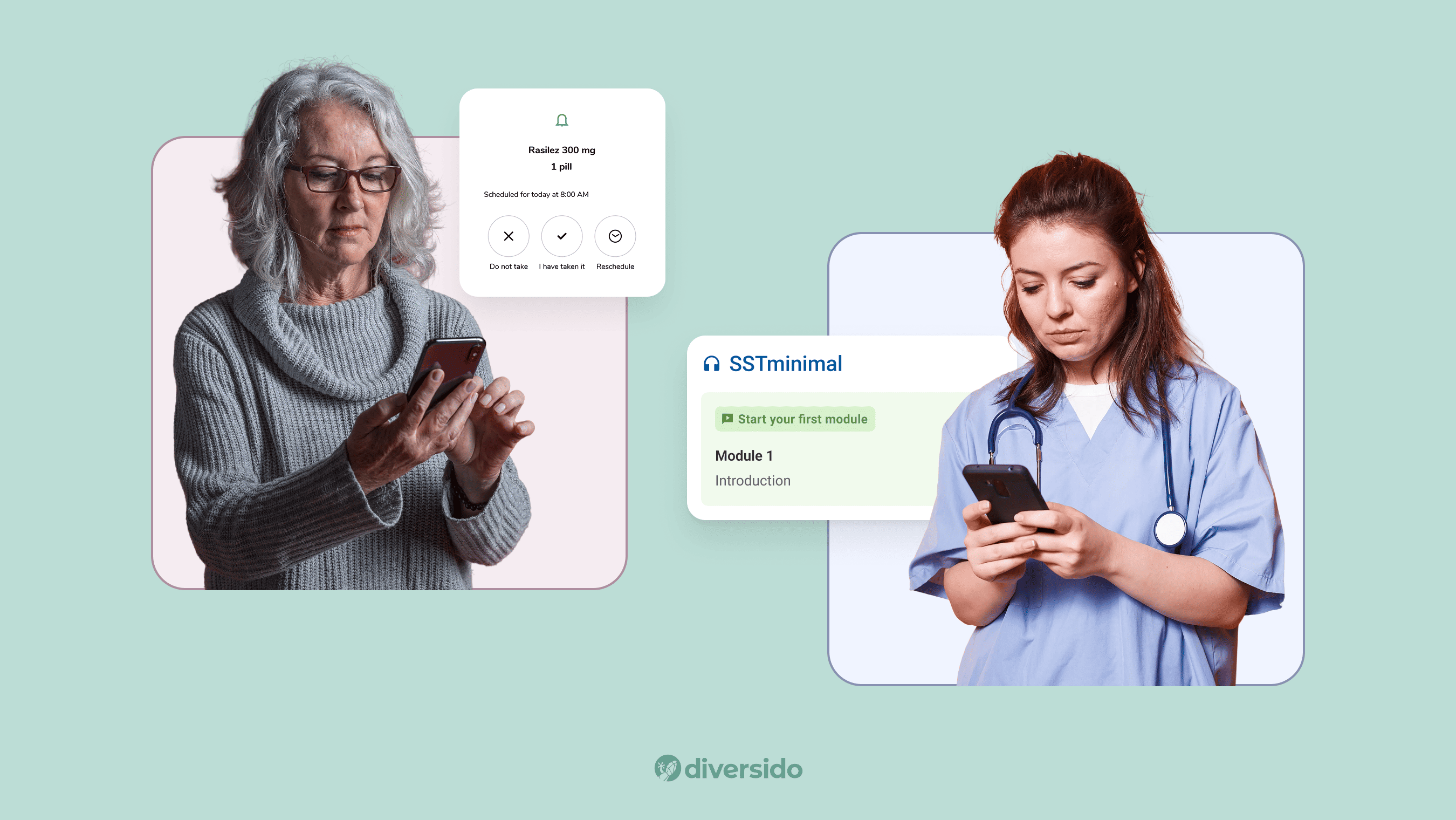
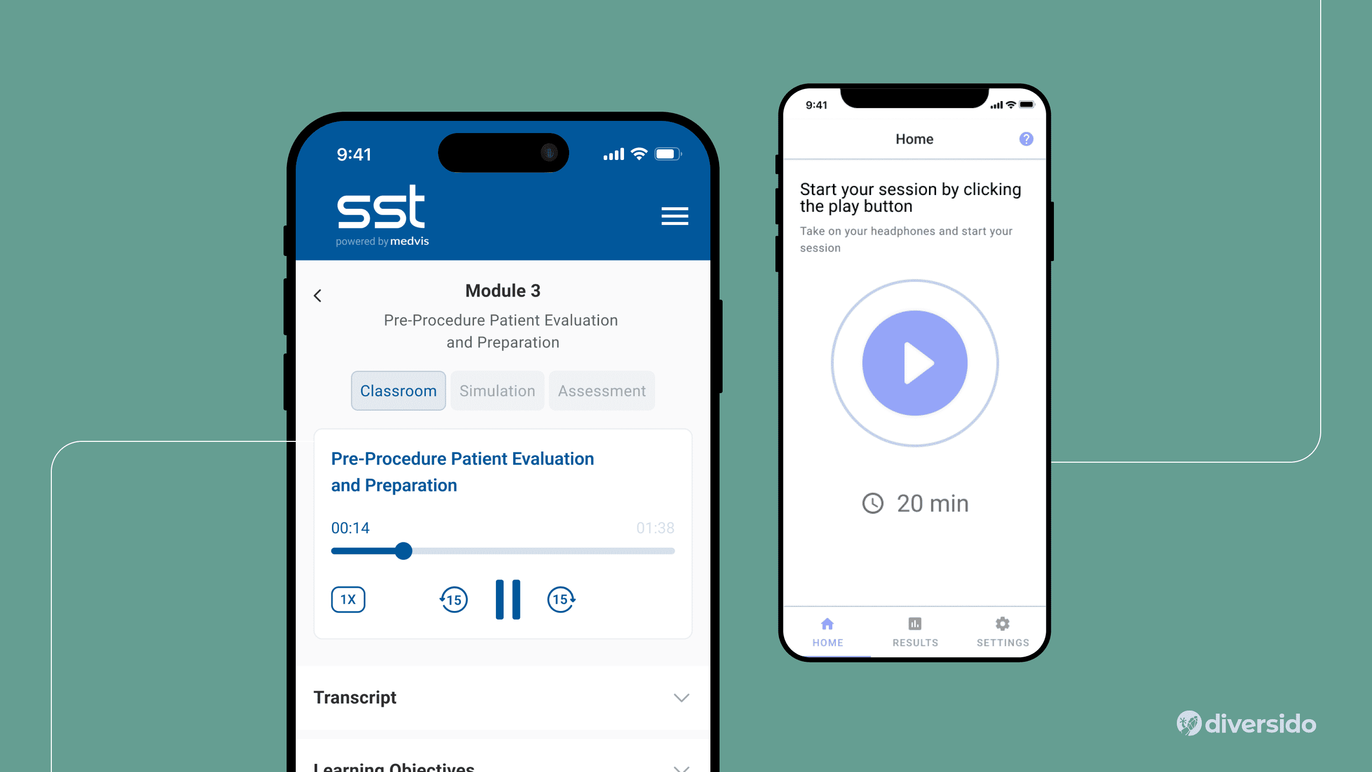
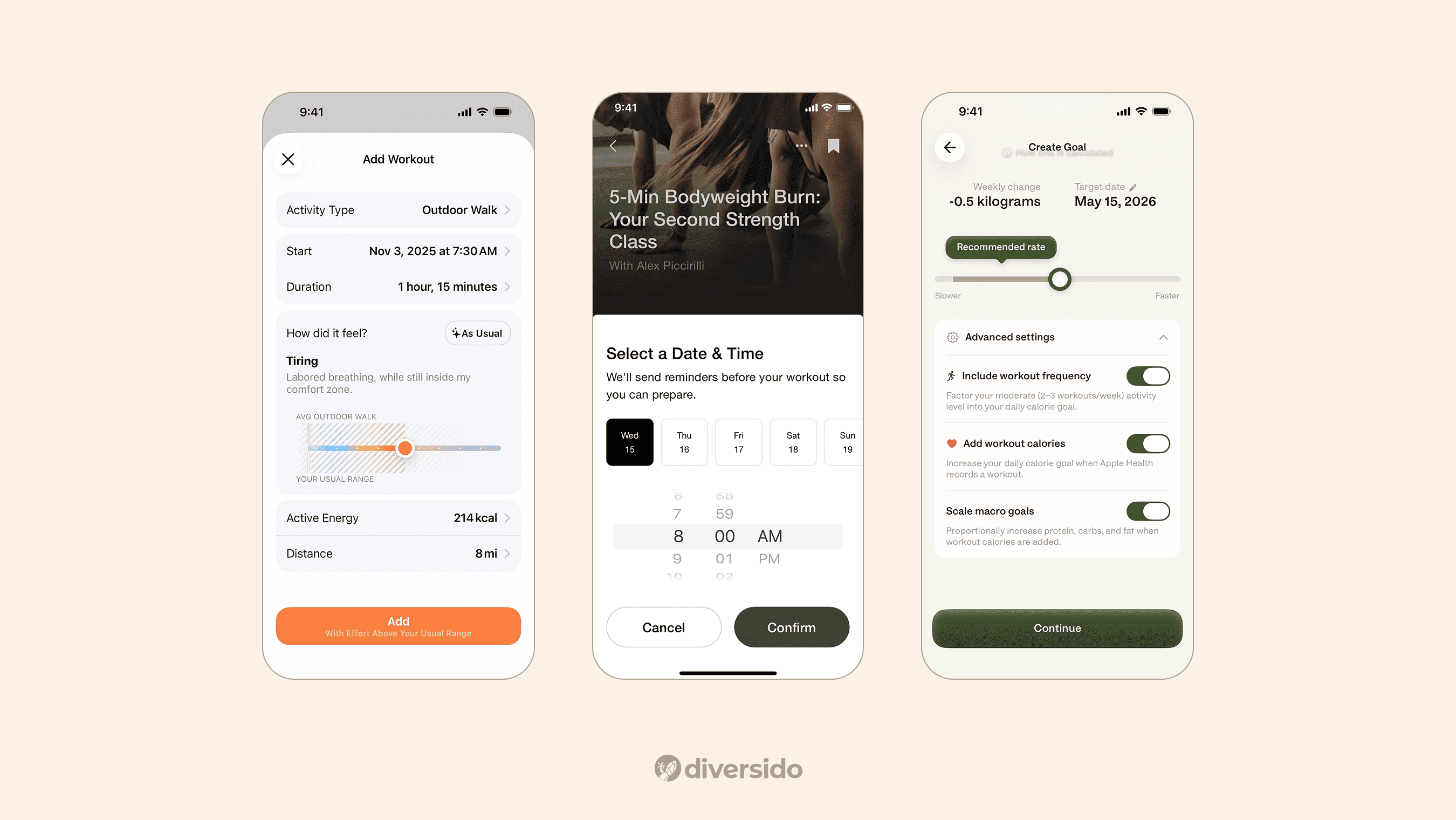
Case in point: MindLoop, a mental wellness app, connects with a neurofeedback headset and guides users through therapy sessions. Its success hinges on a calm, user-tested flow and a privacy-focused architecture.
What Is UI Design in Wellness Apps?
UI (User Interface) is what users see and touch — screens, buttons, colours, typography. It supports UX by making the app visually clear and emotionally calming.
Good UI design means:
- Intuitive controls
- Accessible layouts
- Thoughtful micro-interactions
- Visual clarity for all users, including those with impairments
Accessibility in wellness apps is not optional. Use high contrast, large touch targets, clear labels, and features like Dynamic Type to support all users.
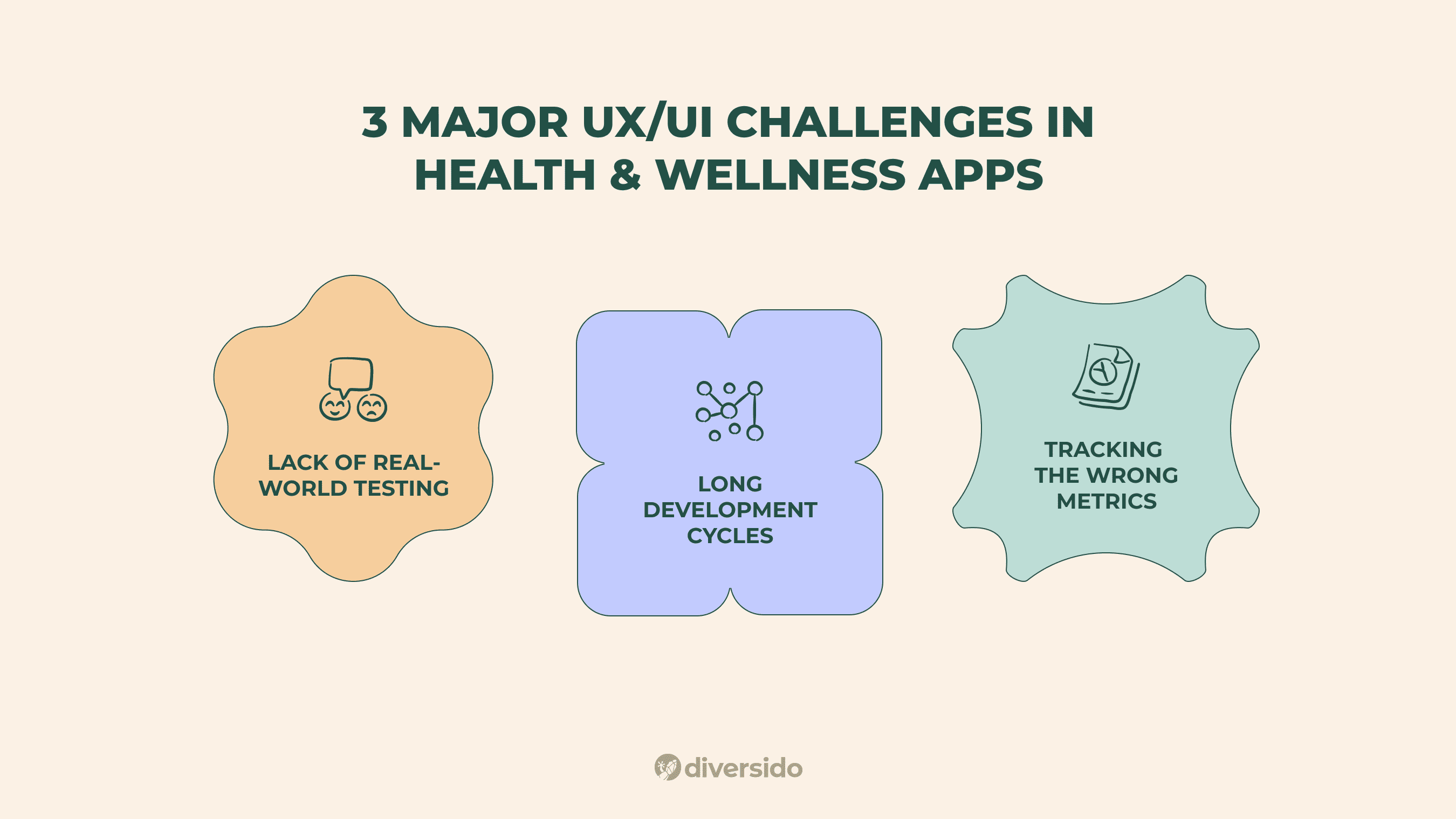
Three Major UX/UI Challenges in Health & Wellness Apps
1. Lack of Real-World Testing
Without usability testing, even simple flows can break. Test early, often, and with real users, not just the internal team.
2. Long Development Cycles
Wellness apps often require updates across multiple platforms. Focus on small, testable releases to reduce risk and build momentum.
3. Tracking the Wrong Metrics
Instead of downloads or screen time, focus on meaningful actions:
- Sessions completed
- Steps logged
- Bookings made
- Return visits at 7/30/60 days
UI/UX Trends in Wellness App Development (2025–2026)
Native UI Design (NUI)
Follow iOS and Android patterns instead of forcing uniformity. This speeds up task success and reduces support issues.
Augmented & Virtual Reality
AR/VR is gaining traction in patient education and pain distraction. Keep sessions short and purposeful.
Voice Interfaces (VUI)
VUI is ideal for low-vision users or hands-busy scenarios like cooking or exercising. Always offer a manual fallback.
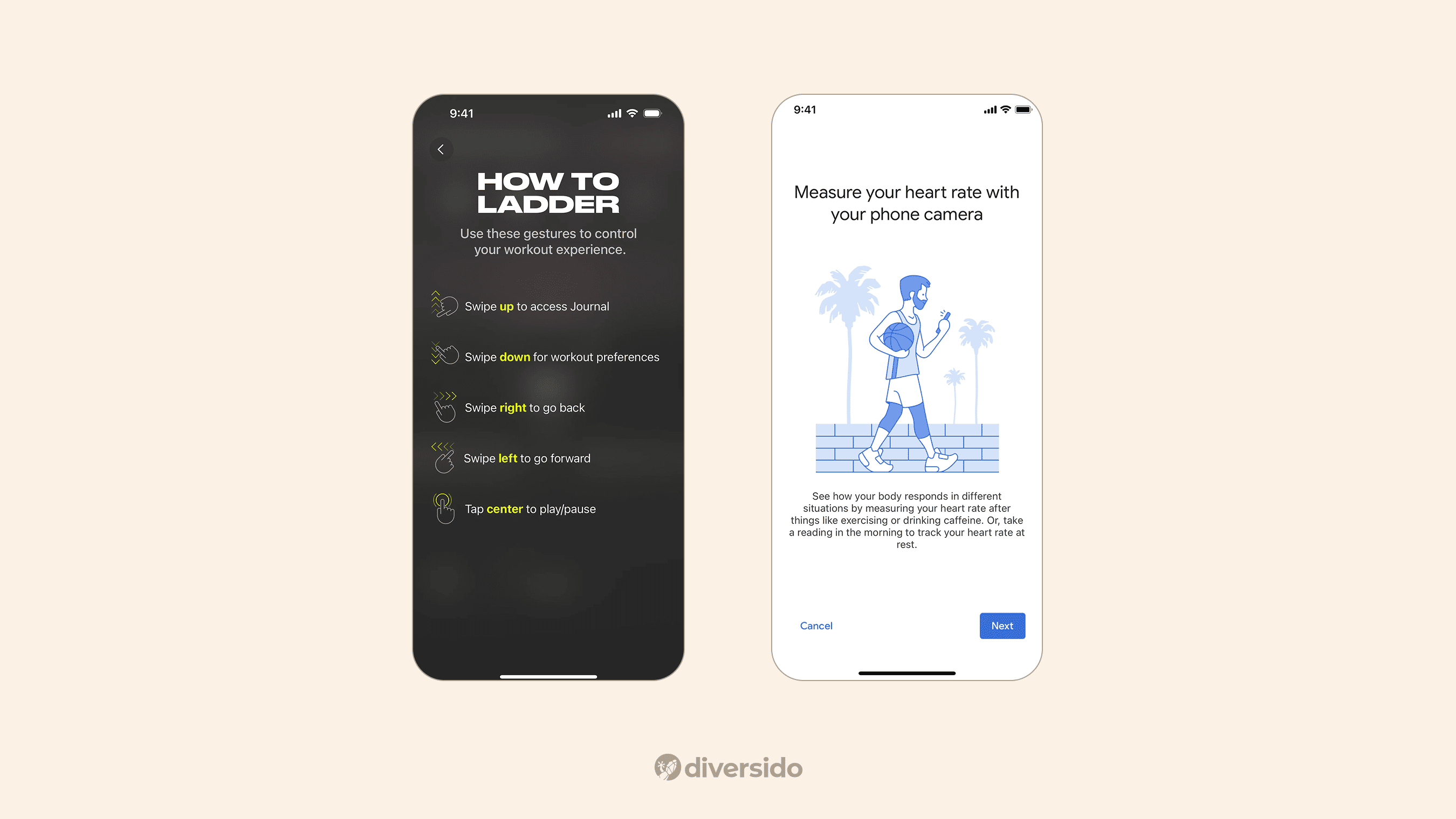
Gesture Controls
Stick to native gestures. Introduce them once and offer visible alternatives like buttons.
UX/UI for Specific Use Cases
Telehealth
- Easy sign-in and secure booking
- Reminders that reduce no-shows
- Clear controls during video calls
Patient-Facing Apps
- Onboarding without friction
- Accessible filters and search
- Nudges that support behaviour change
Example: HealthMentor — a wellness coaching app that syncs with Google Fit and HealthKit to track habits across platforms. A simple, consistent interface helps users engage daily.
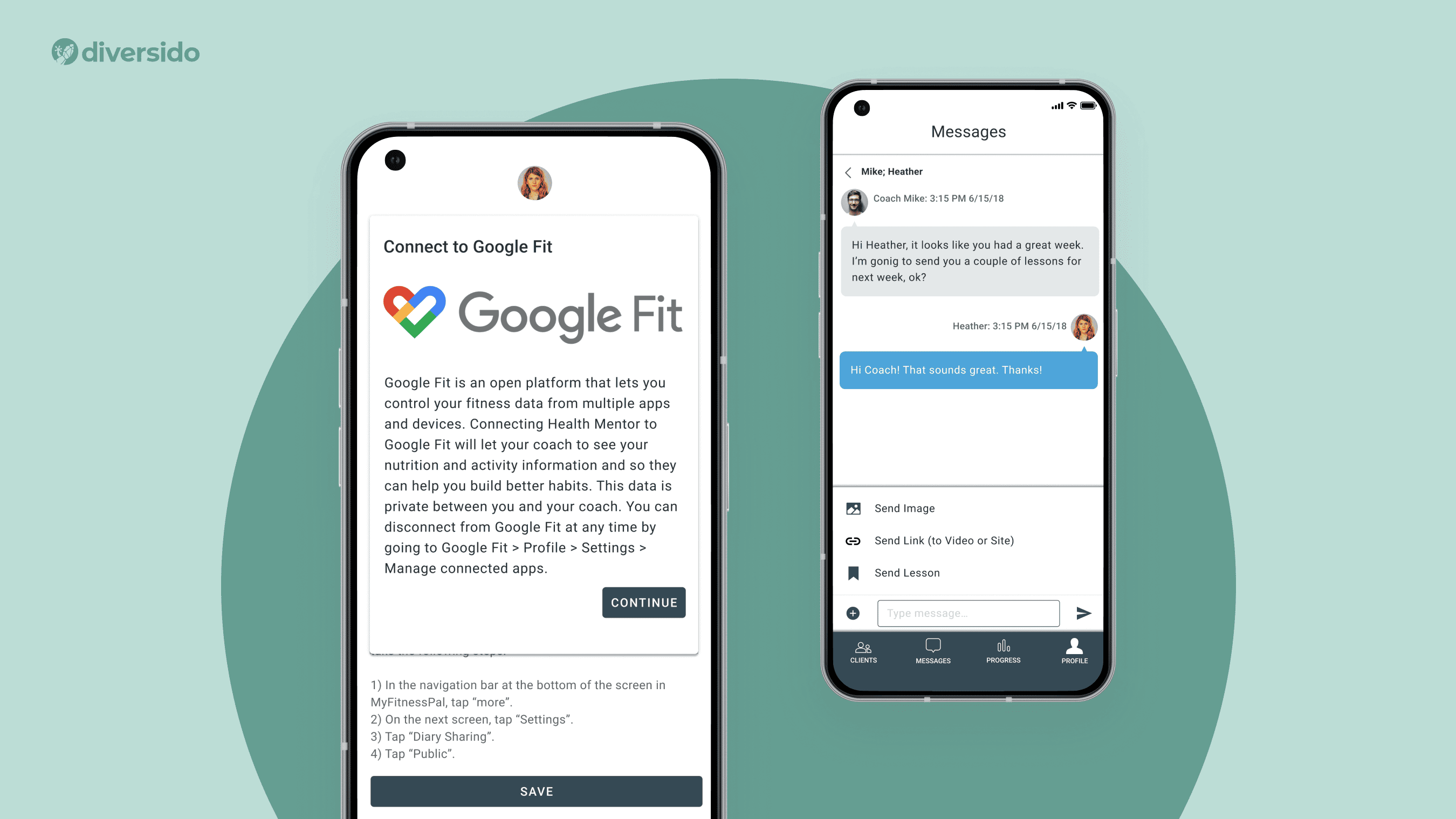
Clinician-Facing Tools
- Reduce re-entry with smart defaults
- Show the right data clearly
- Match clinical terms with plain language
Admin Panels
- Role-based permissions
- Visual dashboards with quick access to system health
Wearables
Design for quick glances and low-interaction screens. Sync data reliably and work offline when needed. Learn how IoT software design supports wearable healthcare devices in real-world clinical use cases.
Chatbots
- Great for FAQs, nudges, or quick triage
- Use quick-reply chips
- Show history and always offer a human handoff
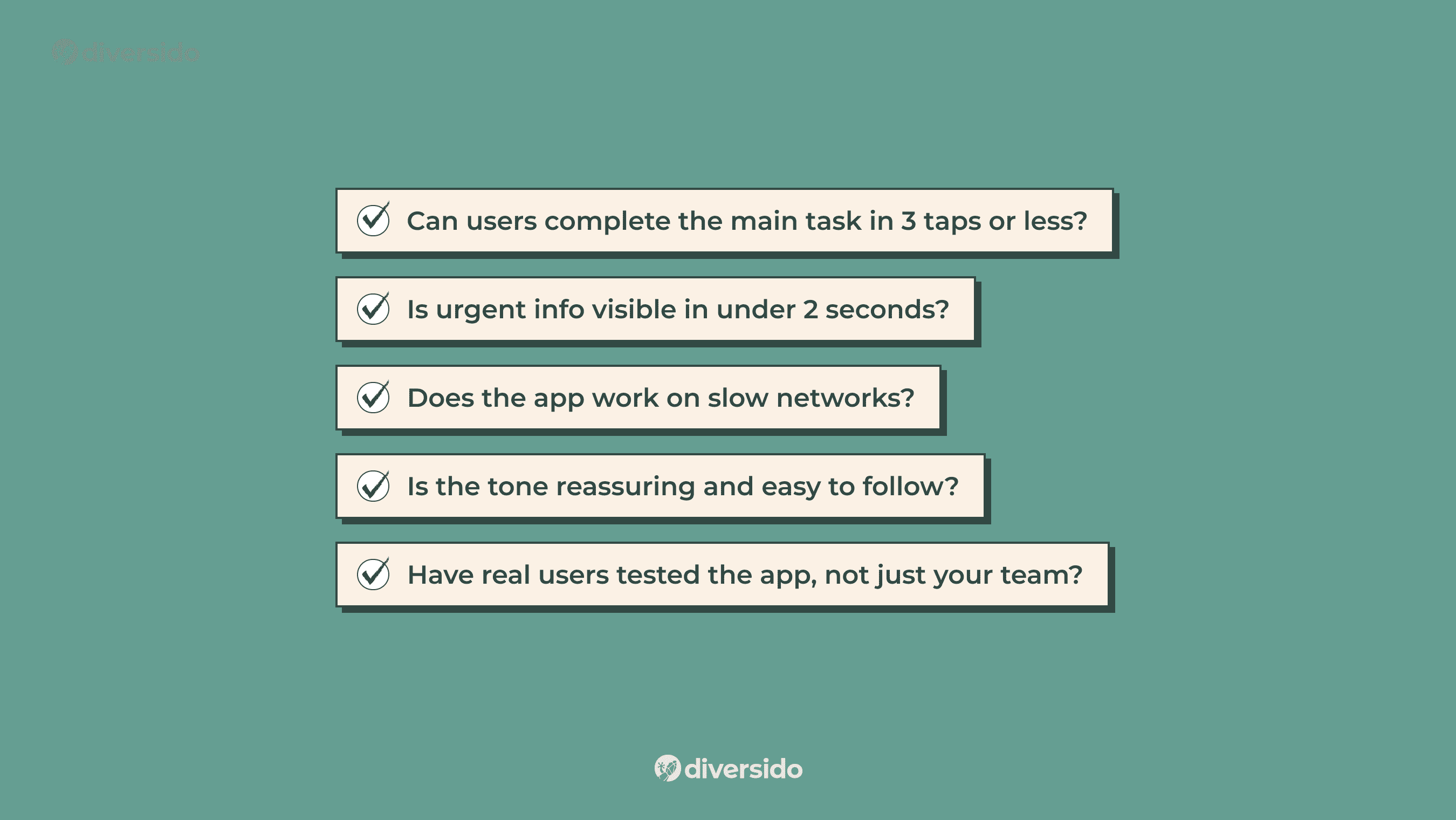
Before You Launch: Wellness UX Checklist
✅ Can users complete the main task in 3 taps or less?
✅ Is urgent info visible in under 2 seconds?
✅ Does the app work on slow networks?
✅ Is the tone reassuring and easy to follow?
✅ Have real users tested the app, not just your team?
The Future of UX/UI in Health Apps
Expect more personalisation, predictive design, and subtle micro-interactions. Wearables and voice will become more integrated. But the foundation stays the same: reduce friction, earn trust, help users succeed.
Curious how UX can boost results in real health products? Explore more of our digital health projects or see how our UX design helped Inspirers increase patient engagement and treatment adherence.
If you’re building a digital health or wellness app and want your UX to actually help people, let’s talk.
FAQ
1. Why is UX/UI critical for wellness apps?
Because users make health‑related decisions under time pressure or stress, a calm, intuitive UX and clear UI reduce confusion, errors, and drop‑off, helping build long‑term habits.
2. How does wellness app UX differ from clinical UX?
Wellness‑focused apps emphasise engagement and habit formation, while clinical tools prioritise safety, traceability and regulatory compliance. Both must deliver accessibility and data transparency.
3. Do I need a native app or is a PWA enough?
Choose native when deep integrations are required (e.g., wearables, sensors, offline health data syncing). A PWA is suited for quicker rollout, wider reach and lighter feature sets.
4. How can I make my wellness app more accessible to all users?
Start with strong colour contrast, scalable text, clear labels and screen‑reader support. Test the UI at 200 % zoom and with assistive technologies to ensure all users succeed.
5. What metrics matter after launch for a wellness app?
Measure meaningful user behaviours: completed health sessions, logged habits, bookings made, and return visits at 7‑, 30‑ and 60‑day intervals. Downloads alone don’t reflect success.
6. How do I improve UX to boost retention in wellness apps?
Focus on streamlining the user flow, reducing steps and making key actions obvious — retention improves when users can achieve core tasks in under 3 taps and the interface feels familiar from day one.
7. What common UI mistakes should wellness app developers avoid?
Watch for hidden controls, inconsistent gestures, poor contrast, non‑intuitive icons and mandatory onboarding tasks. These reduce trust and increase drop‑off.
8. Which features drive wellness app user engagement through design?
Accessible reminders, habit‑building dashboards, personalised coaching cues and quick‑tap main functions (like log entry or session start) are high‑impact design features. When these are well‑designed, engagement rises significantly.
9. What are effective best practices for UX in health & wellness apps for 2025 and beyond?
Prioritise adaptive interfaces that respond to user behaviour, integrate voice and glanceable UI for wearables, ensure privacy‑first architecture and evolve with device trends — these are what top wellness apps focus on today.
.webp)

