


Which Interface Design Solutions Should You Consider for Your Medical App?
Designing medical apps is about clarity, calm, and trust—not just looks. Learn how smart UI choices, like colour, can improve safety and confidence.

Colour
Colour sets the emotional tone of an app and guides users through the interface. In healthcare and wellness, it also shapes how safe, calm, or motivated people feel. Keep meanings consistent so colour supports decisions rather than distracts from them.
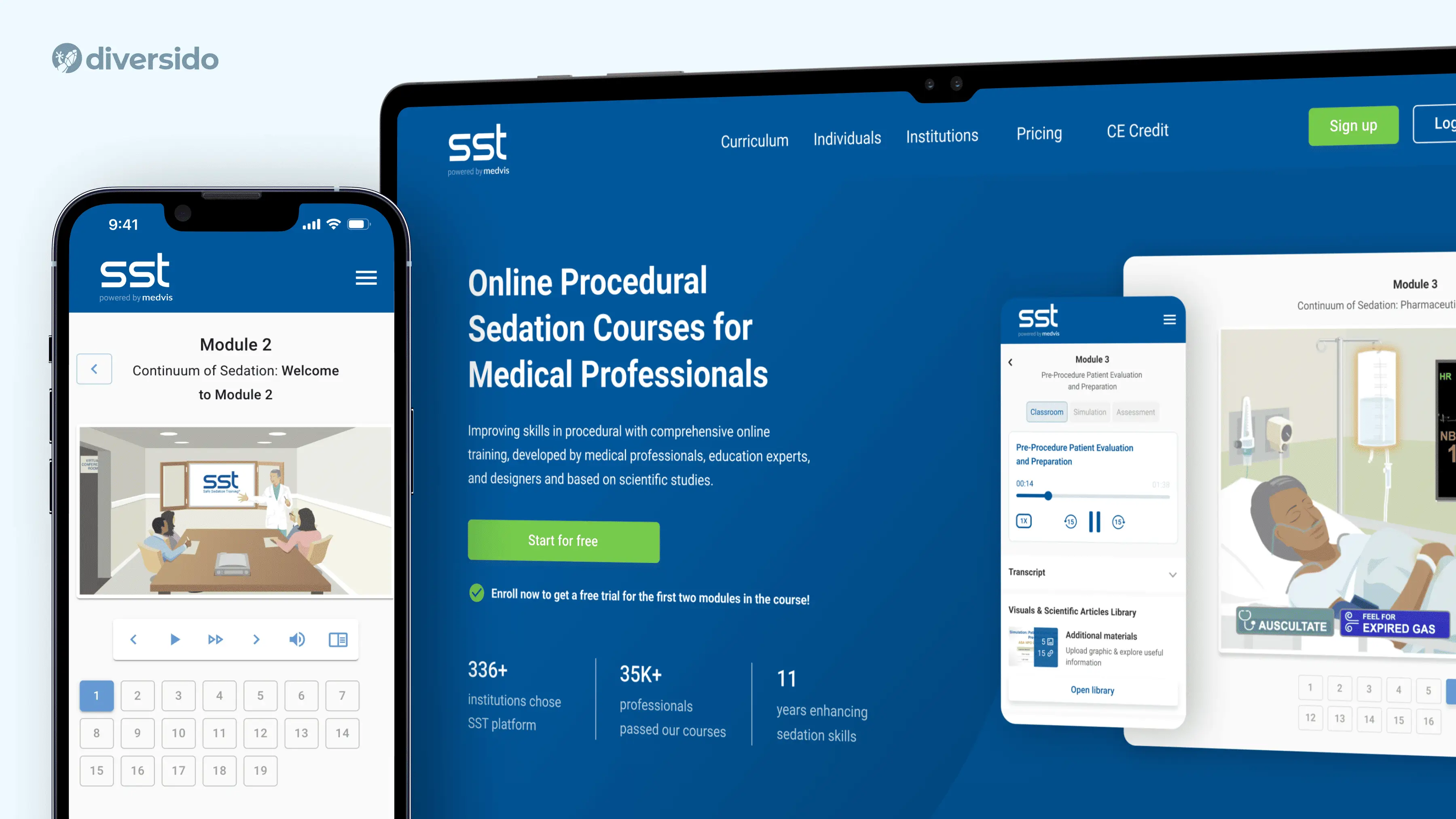
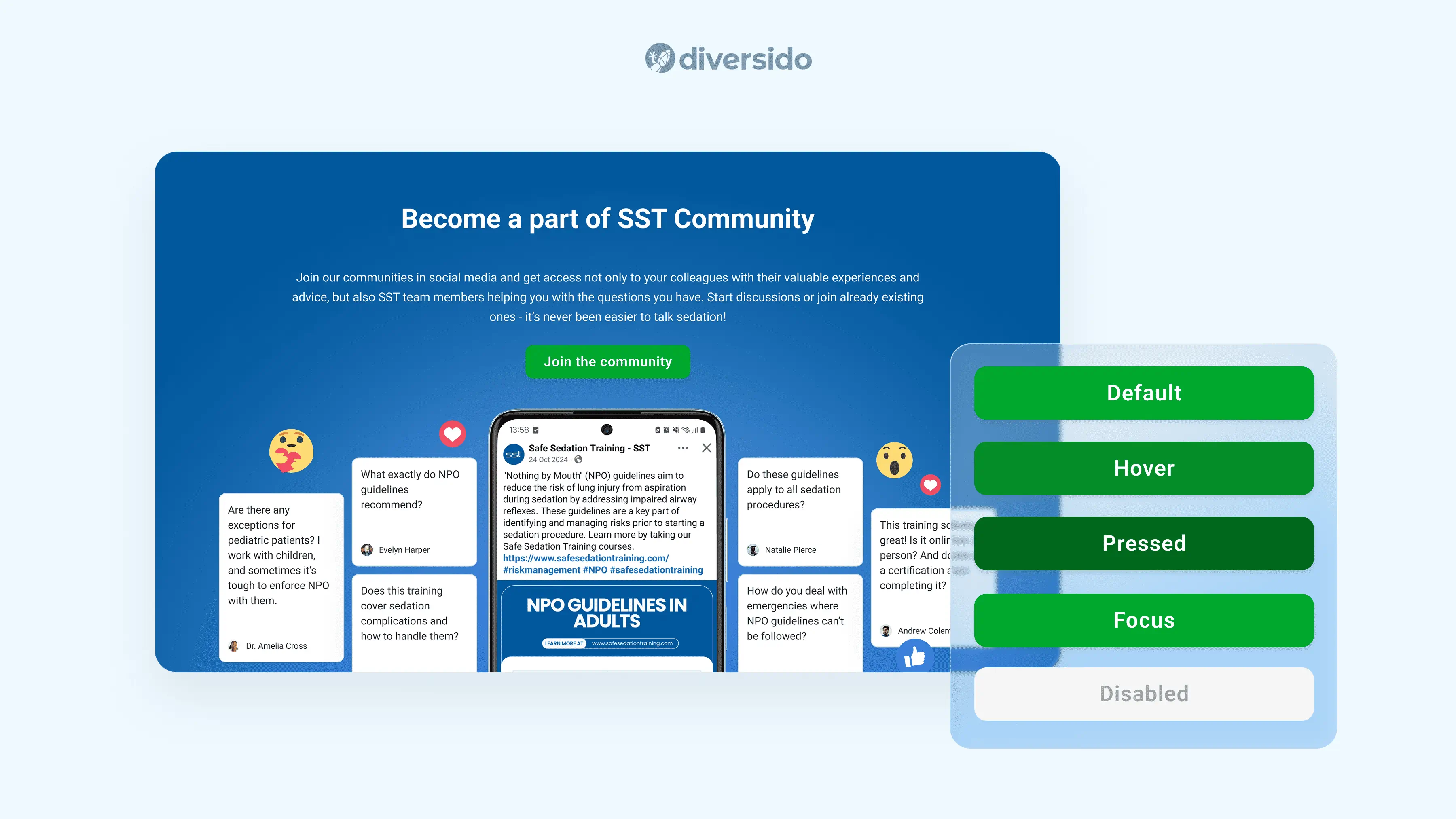
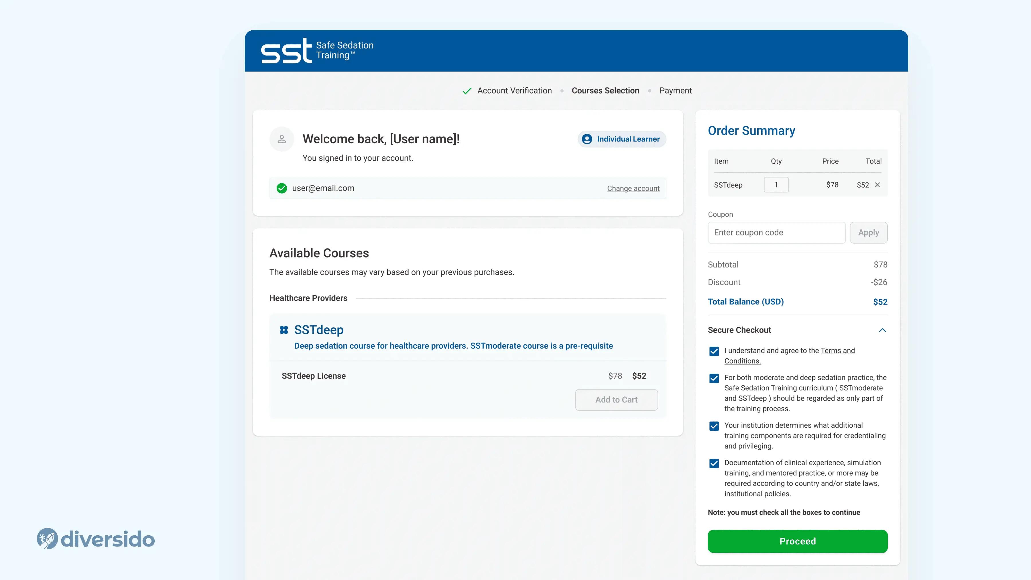
- Safe Sedation Training (SST) → We used light-green CTAs. Green quietly says “go” and feels reassuring, so clinicians move through training without second-guessing.
- MindLoop → We kept lilac buttons to match the soothing palette. The softer colour lowers tension but still stands out enough to tap fast. It’s very helpful for people managing ADHD, anxiety and sleep.
.webp)
Buttons & Accessibility
Buttons need to be both visible and intuitive, because they drive the most important actions. In health apps, clarity is essential. Vague labels or weak contrast can slow people down or cause mistakes. Design for visibility, accessibility and tone in equal measure.
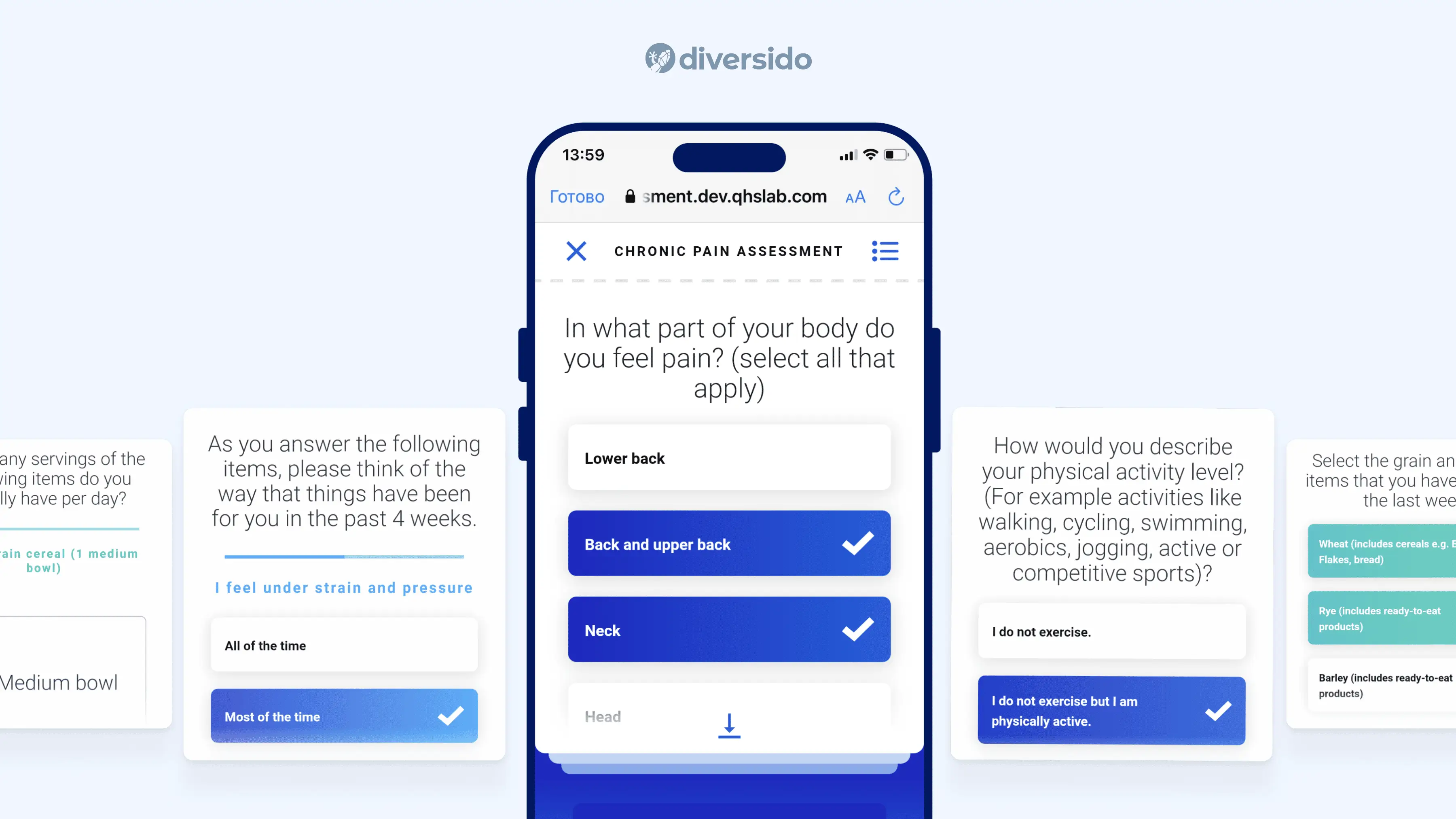
Aim for 44×44 px (often 56 px in stressful contexts), sentence-case labels like “Book appointment”, and clear states for loading/success/error with a next step.
- SST → After each module, we show buttons such as Next, Continue, and Finish. All buttons have labels and clear call-to-actions for the user
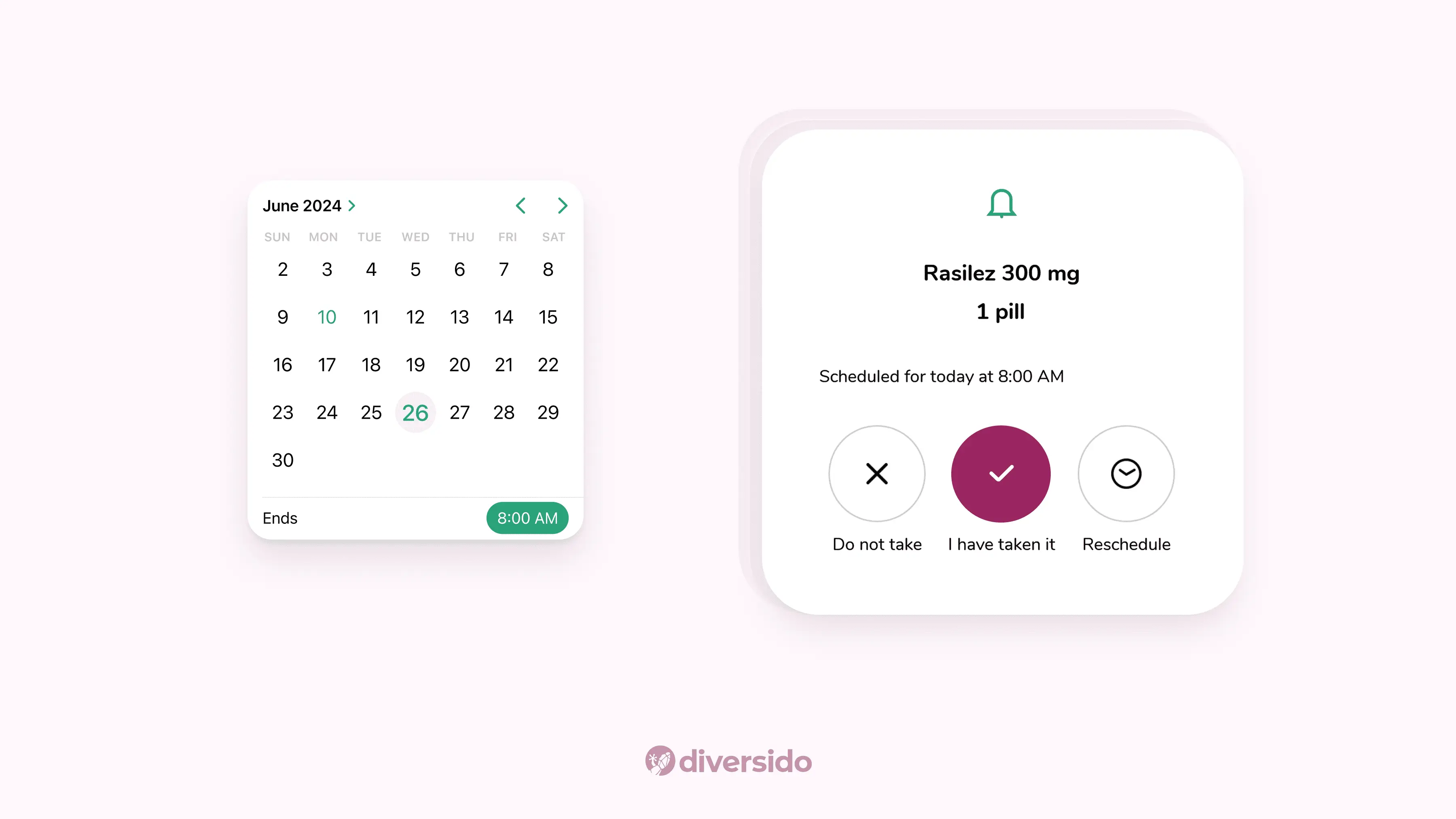
- Inspirers → To support older users managing hypertension, the interface prioritises reminders, pill counting via image detection, and easy-to-read alerts. Everything from font size to interaction flow is designed to minimise error and support routine medication adherence.
Navigation
Navigation is the quiet map of your product. When paths are predictable, people relax and move faster. In busy or stressful contexts, one clear way forward is better than many clever options.
- QHS → A persistent bottom navigation and breadcrumbs inside records mean you always know where you are and how to get back.
- Brain Health Monitoring App → Progress indicators and modular task flow create a sense of structure. Users always know what step they’re on, what’s next, and how much time remains. Cognitive comfort is especially important for apps focused on brain performance or memory care.
Tone & Microcopy
Tone is how your product speaks when no one’s watching. Plain language, gentle prompts, and measured motion help people feel informed, in control, and supported, especially when they’re tired, worried, or short on time.
Measured motion isn’t just about style; it’s an accessibility principle. It ensures animations and transitions are relevant, understandable, and never overwhelming.
- QHS → Gentle transitions and no jumpy pop-ups keep the experience calm.
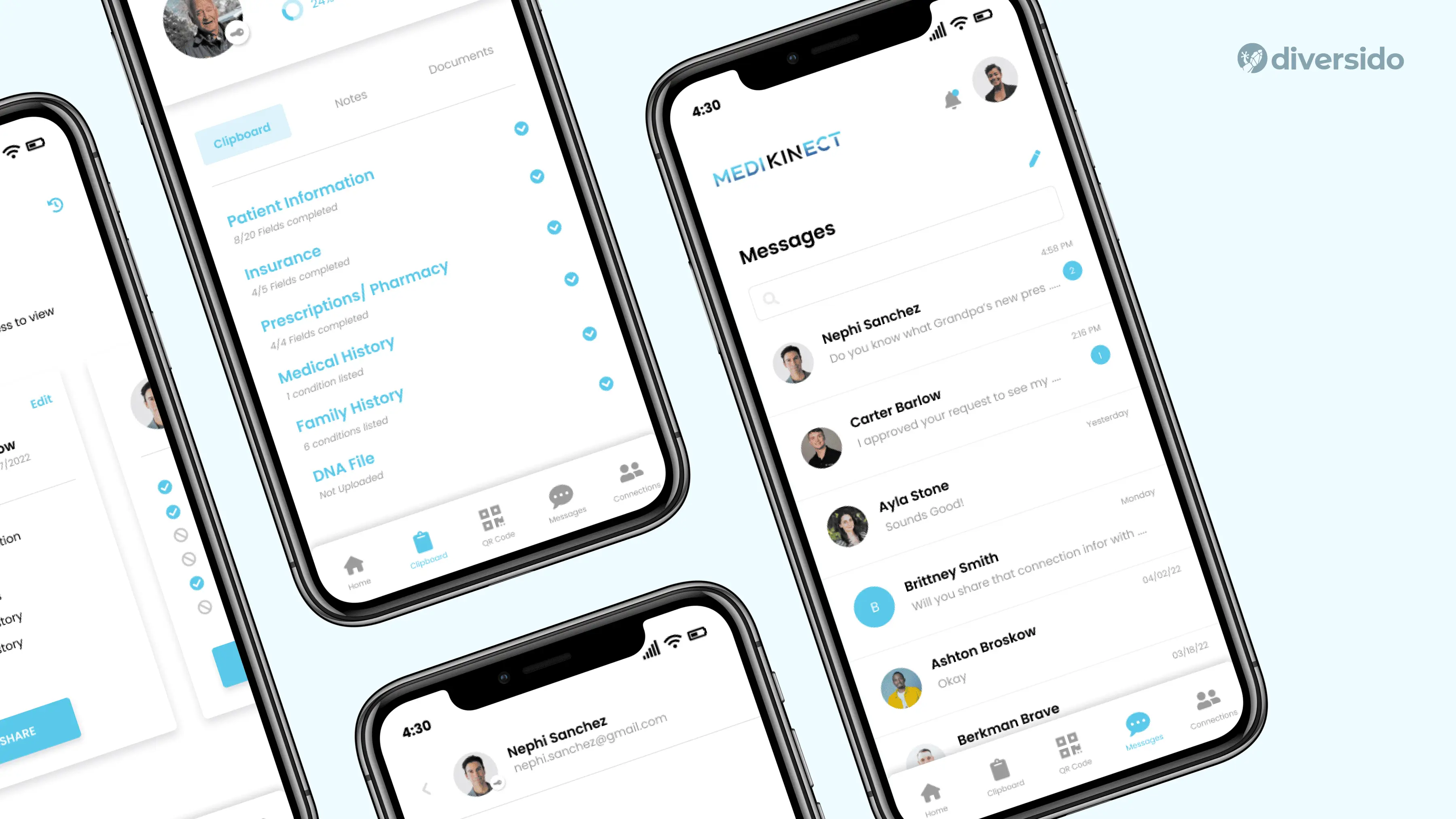
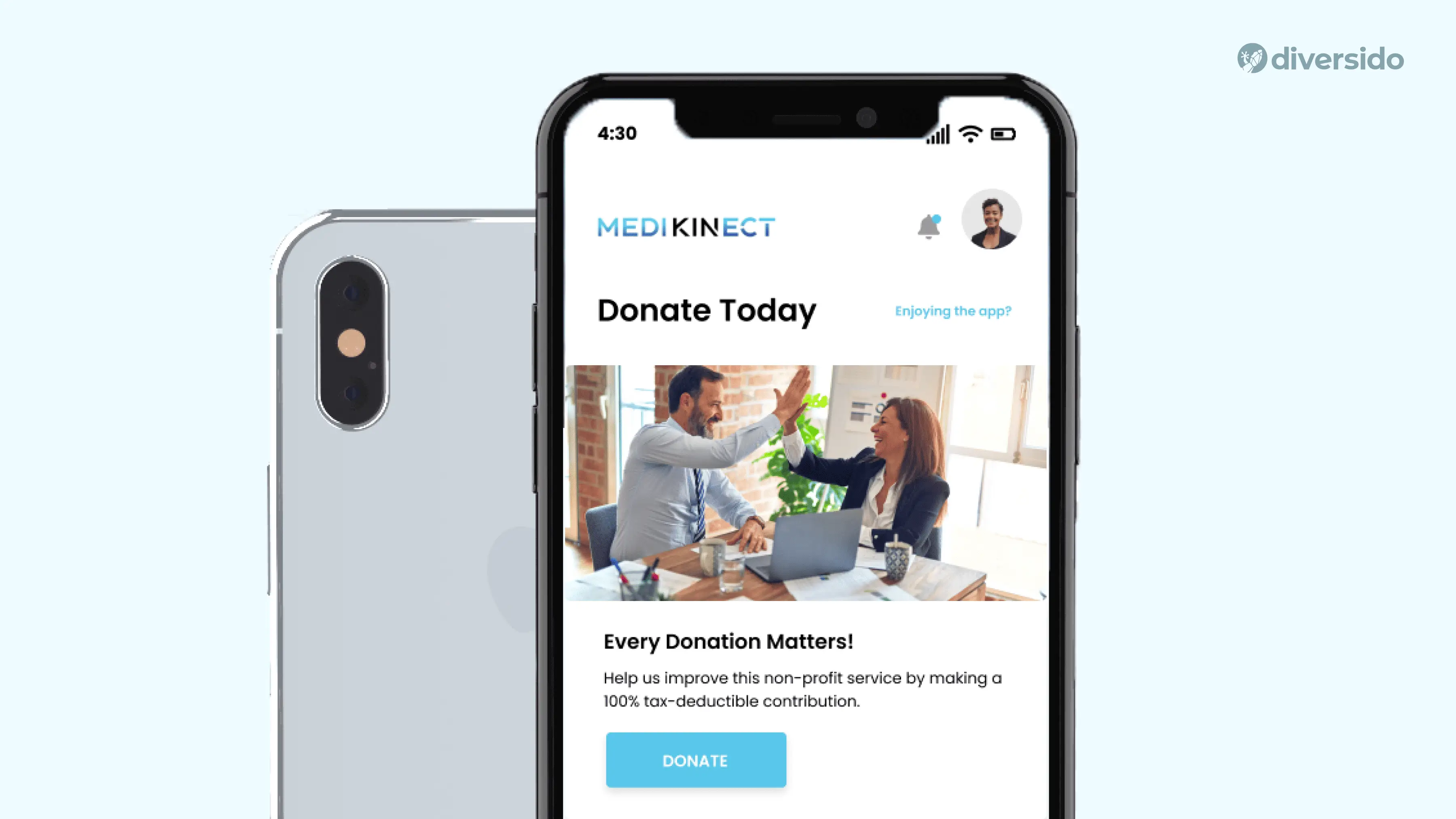
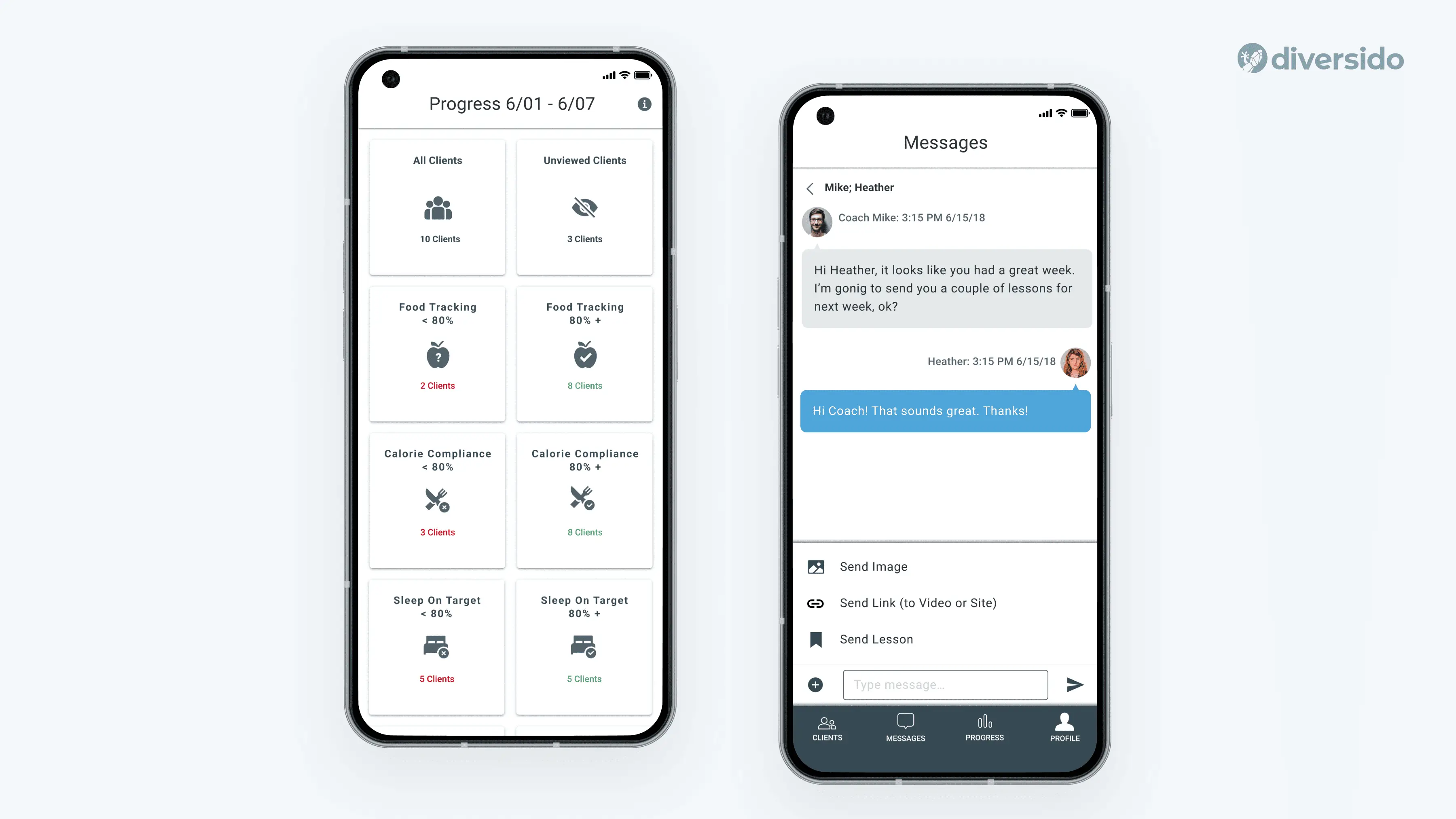
- MediKinect → Clear, straightforward copy paired with soft tone-of-voice makes clinical tasks less intimidating. Button labels and instructional text reduce ambiguity, while a consistent type scale helps users focus, which is especially important in high-stakes environments where attention is split.
Typography & Readability
Type is the voice of your content. Familiar fonts and sensible sizes make information easy to scan, reducing errors and speeding up tasks for everyone, not just people with perfect eyesight.
Aim for a type system that supports fast scanning, clear hierarchies, and fatigue-free reading.
Mobile: SF Pro / Roboto
Web: Inter / Open Sans
Baseline sizes: Titles 32–40 px; Body 16–20 px; Captions 12–14 px
- SST → Roboto, a familiar Android system font, supports clear hierarchy (32–36 px titles; 16–18 px body), helping users scan easily. Combined with generous tappable areas, it makes long modules feel lighter and reduces mis-taps, especially for older users.
- MediKinect → A disciplined type scale separates data, notes and actions so clinicians can scan fast.
Icons & Imagery
Visual cues do the heavy lifting when words are scarce. A consistent icon style and brief labels reduce guesswork, while thoughtful illustrations help soften complex or sensitive topics without getting in the way.
- Health Mentor → Clean, minimal icons and structured layouts make nutrition and behaviour data easy to scan. Lessons are paired with subtle visual cues to keep focus on content, not decoration.
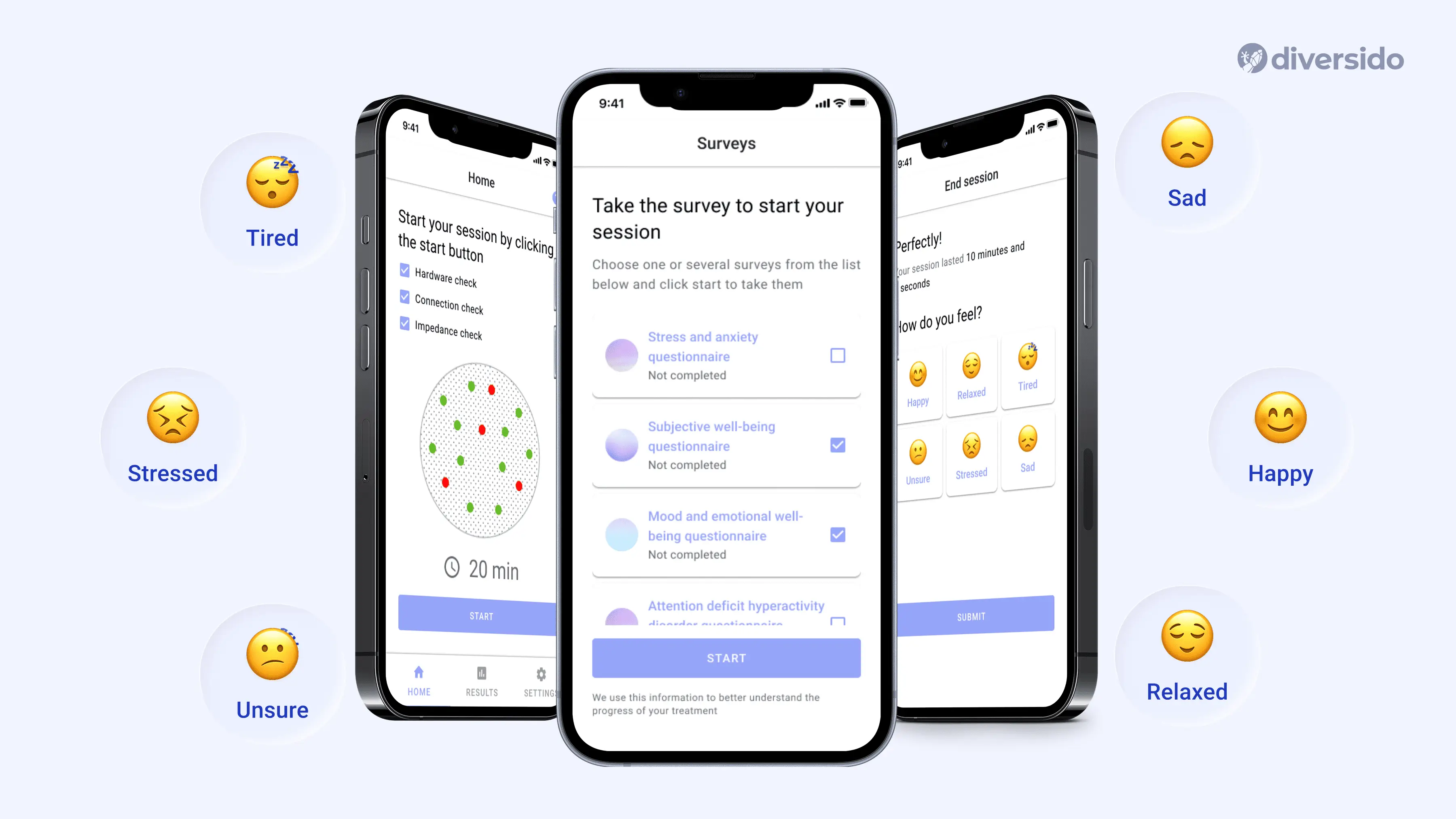
- MindLoop → Calming illustrations, soft colour palettes, and expressive emojis support emotional self-check-ins, making the mental wellness experience feel approachable and safe.
Privacy You Can See
Privacy isn’t a legal page; it’s part of the user experience. Clear consents, sensible permissions and easy exports build trust, especially when they appear right where the decision happens.
- QHS → Clear, user-friendly permissions in the flow (“Who can see this result?”) instead of burying them in settings.
- SST → Privacy policy is shared during the purchasing flow, with notification preferences offered up front. Users choose how often they want updates: weekly, bi-weekly, or monthly.
Tiny Details, Big Difference
The small things are what people feel first. Helpful empty states, polite confirmations, an “Undo” when it matters and gentle feedback motion make the product kinder — and support queues smaller.
- Add offline or poor-signal fallback plans for environments where users frequently move between buildings, basements, or remote areas.
- Use animation to guide, not distract. Motion should help users follow what’s happening, such as showing progress or confirming actions, instead of being purely decorative.
- Enable dark mode as the default in settings such as hospitals, labs, or ambulances, where lights are dimmed, screens are shared, or night shifts are the norm. This reduces eye strain, preserves battery life, and helps clinicians stay focused without overwhelming brightness.
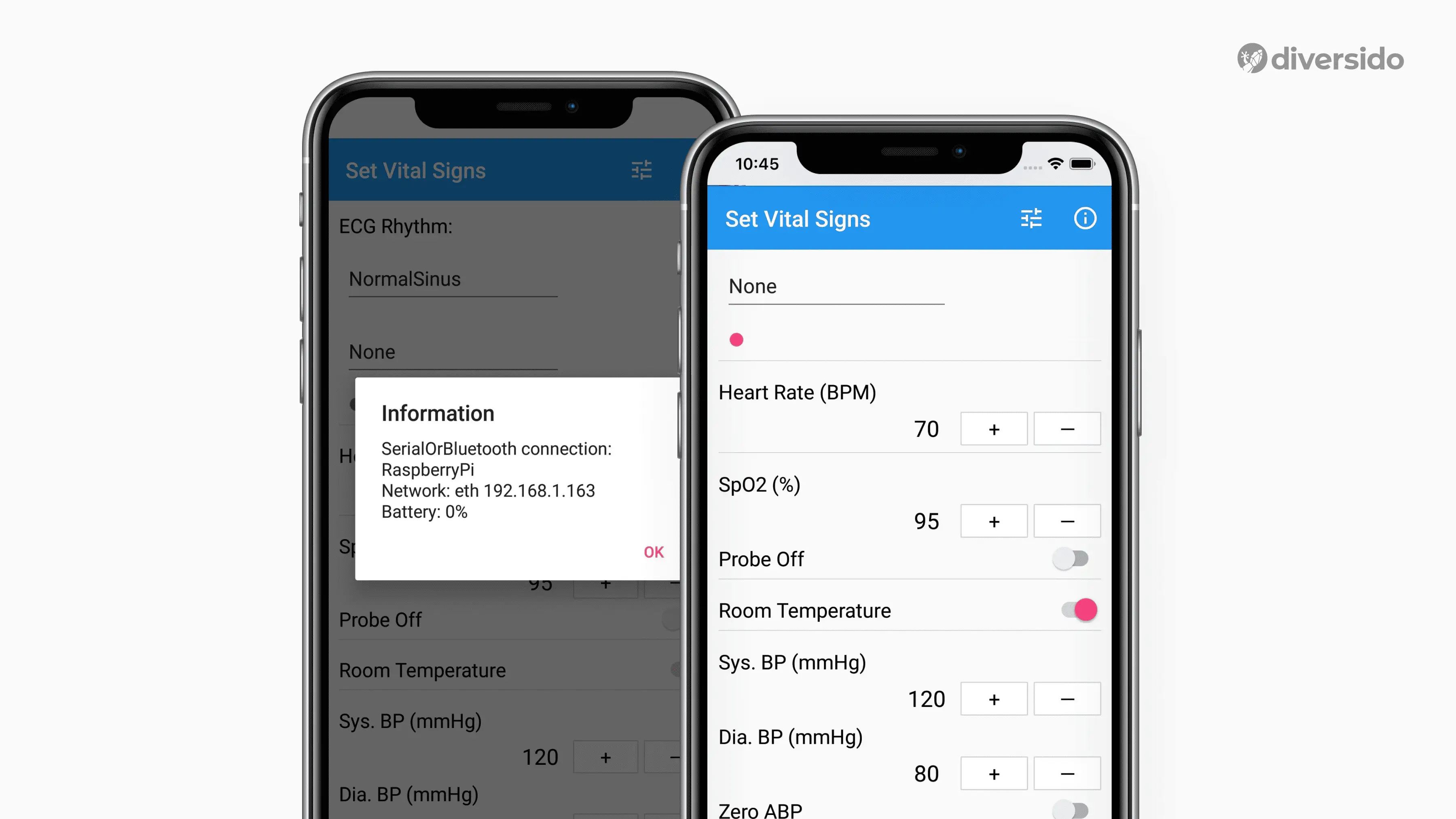
Vitals Bridge → This app keeps core actions fast and low-friction and is used to train medics for emergencies. In a high-stress context, even the smallest delay can derail training; that’s why the interface in this app is stripped down to essentials: clear vitals, large input targets, and fast-switching parameters for hands-on scenarios.
Before You Launch
Before you launch, pause and do a quick reality check. Ask these questions first; they matter more than a long technical checklist.
- Can your grandmother use this app without help?
- Would you trust your own health data to this interface?
- Have you tested with actual patients, not just designers?
- Can users complete critical tasks in fewer than 3 taps/clicks?
- Is emergency information accessible within two seconds?
- Would this work during a stressful medical situation?
Need a calm, trustworthy design for health or wellness?
We can audit your current flows or help design a new one.
Book a 30-minute design review with practical next steps diversido.io/contact
.webp)

